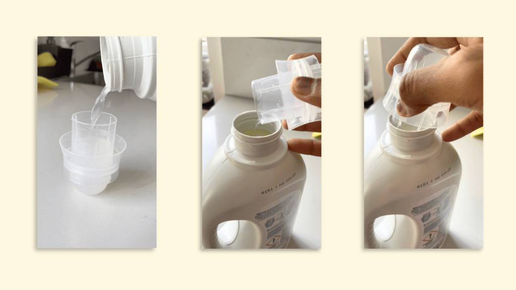
Have you ever scrolled through an endless list of years just to find your birth year?
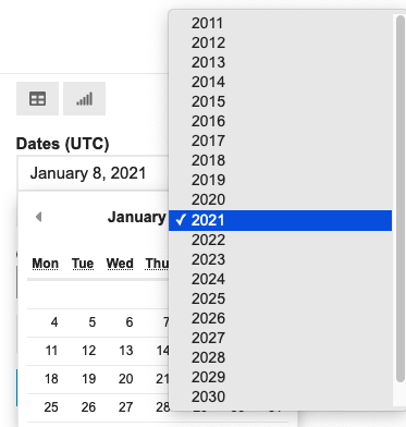
It is a minor annoyance but annoyance, nonetheless. We encounter these micro-interactions in digital products every day.
On a paper form, you simply write down your date of birth. Why can’t we do the same online?
In the real world, “01st Dec, 1980,” “01/12/1980,” and “December 01, 1980” are all acceptable ways to write a date of birth. However, analyzing non-uniform data is challenging. Analysis becomes much simpler when dates follow a consistent format.
This is why user input needs to be collected in specific formats — to maintain data consistency and uniformity. However, for the sake of solving this consistency problem, we cannot sacrifice user experience.
In the above example, users should be able to both select and type the year. We can validate the entry immediately and prompt for corrections if needed. Put simply, there are always ways to enhance the experience.
These seemingly tiny details are important in Product Design. This is why, Designers and Product Managers work together to design excellent products by performing research and user tests. Well, at least in theory.
Let’s take a look at 4 interactions you must have encountered before.
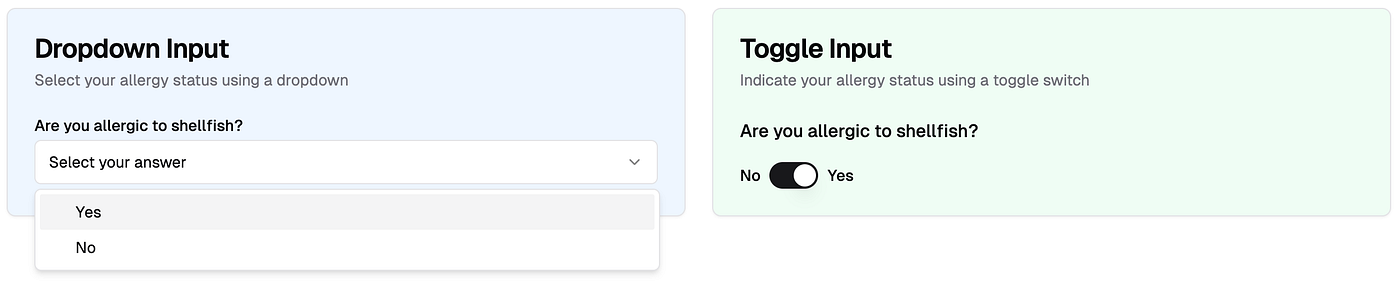
When you have 2 choices in input → should it be dropdown or toggle?
Would you have a preference? If it is single question, probably not. But imagine it is a medical form and they need to know all sorts of pre-existing conditions, say 20 questions. Would it be different then?
Selecting date → what should be the default date on the date picker?
Should it be blank? Should it default to current date or some arbitrary date? That’s a decision to be made.

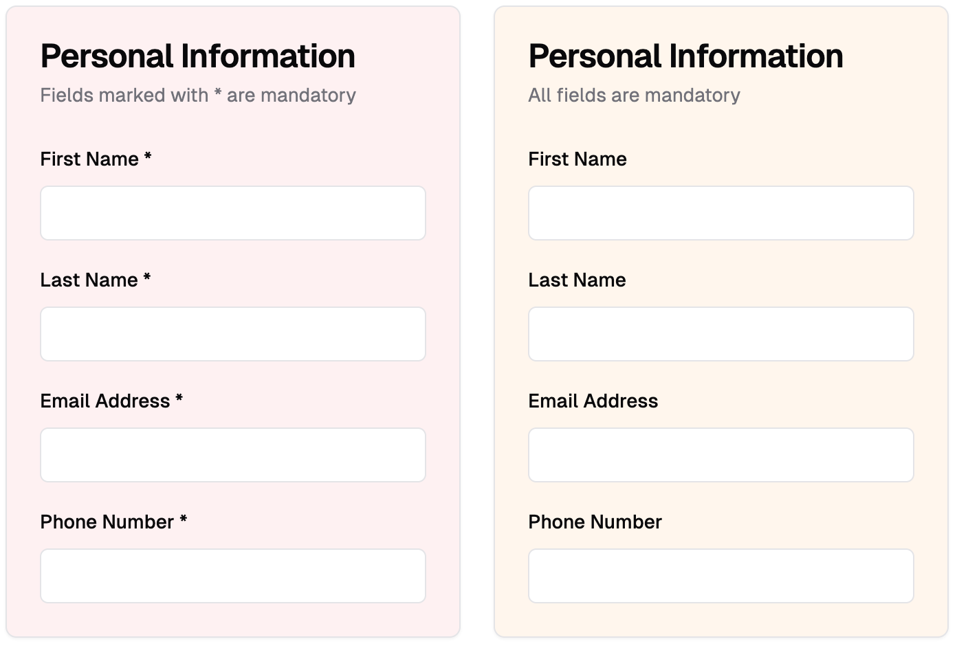
Indicating mandatory inputs → should we indicate mandatory inputs for all via asterisk?
Would you have a preference between 1st and 2nd? Imagine slightly longer form where 15 out of 20 questions are mandatory, what will be the design choice then?
Should the error message be dismissed automatically or by the user?
It sounds like a no-brainer until you put it in a context and suddenly you don’t want to automatically dismiss the error.

It is very tempting to choose one over the other. However, without proper product discovery, you might end up choosing the incorrect UI element. It is not the UI element, it is the placement of that element in the context of the product.
Do this exercise — check a form, preferably a longer one, in your product or any other product. Try filling it without making any errors. Record that experience. Highlight minor annoyances.
Why do some forms have bad user experience?
That’s a really good question. The people who build these products often know the answer and it could be one of the following:
- Technically challenging: I say challenging not impossible because minor interactions are not impossible to change but they can take time or cause dependencies. You cannot simply change the Date Picker one fine day and not worry about impact on everything else. Think about data storage, analytics, operations work etc.
- Design team wants to adhere to some “core principles”: This may happen in certain companies where the design team has strong opinions on the UX. Sometimes, having strong design opinions can work in their favour but other times, it may not. Think of Airbnb; they seem to have strong design opinions but I often think their UX is more complicated than other booking sites.
- Time to build and Time to release: If you have ever worked in the Design, Product or Tech team, you will know that every discussion boils down to “We have a tight deadline therefore, only highest priority items can be fixed.” Inevitably, minor interactions are never highest priority. This is why, you will notice some popular products with poor UX.
- Design Debt: Just too many optimisations causes inaction. As a designer, if you list all the improvements for your product you are going to have at least 10–15 things on the highest priority. Knowing your team’s bandwidth, you may not even highlight those issues. Therefore, you continue to accrue debt.
Is there no way out?
Of course, there is. Every company eventually finds a way out to resolve these issues. However, the reasons to do so will depend on the company’s priorities for that month, quarter, or year.
Let’s say, too many people drop off before completing a form and that causes users to not subscribe or pay. This is a huge risk. It affects business metrics. You bet, the whole team is going to work for next few weeks fixing tiniest of UX issues.
Compare that to filling up a feedback form inside the dashboard, it is not perceived to be huge risk.
It is a delicate dance between company priorities and great user experience.
From my experience as a Product Manager, the best way to minimize this type of debt is to invest time upfront in discussing and debating on micro interactions, carefully weighing the pros and cons of each UI element before development begins.
Which micro interactions have annoyed you recently?
Shout out to my ex-designer colleagues — Anas, Nikos and Denis. They always challenged me to think differently. And I could nag them with my thought experiments.
Note: All visuals in the example section have been generated using V0.dev product. I explored V0.dev a while back: check here