Author: Maria Martin

  • From Idea to 40+ Appointments: How I Built an App a Real Business Actually Uses

    From Idea to 40+ Appointments: How I Built an App a Real Business Actually Uses

    Few months back, Physiofit app was only an idea and now it is used daily with over 40 appointments and 20+ clients added. I built this app entirely in Biscuit for my friend, Dr. Consecao, a Physiotherapist. To build and launch an app as a non-technical person feels like a highlight of my career.

    In this article, I share in detail on some of the important aspects of launching products – how I got idea, how I built the app, how I operationalised it, how I monitor it and how is the app’s growth now. If you are in one of these phases, you might find some things useful.

    So let’s begin with the first one.

    How I got the idea?

    During my trip to India in November 2025, I booked a physiotherapy session at my friend’s clinic. After the session, we talked about her business. During that conversation, I learned more about her business operations and the expansion plans.

    Here are few things I observed:

    • Clients call her on the phone to book the appointments. She makes a note of it in a book. She shares the roster with her team by taking a picture and sending on Whatsapp.
    • She has intake forms for new clients. They’re not digital, all on paper.
    • Her day is extremely busy leaving her no room to explore ways to make her business operations efficient. She wanted her processes to be efficient but there was simply no time.
    • She also wanted to analyse her past data of clients but that meant flipping through pages and manually doing it.
    • She did try searching for tools for appointment management but found them ‘too complex’ to begin with.
    • She knows her regular clients and their progress really well. However, she could not follow-up with her older clients and retrieving that data was not easy.

    How I decided what to build?

    I am not going to lie, I was very tempted to build all the features at once. I stopped myself and started thinking of a phase-wise approach. I wanted to build a version that she could start using quickly.

    I pitched her an idea for an app that would help her with exactly 2 things:

    1. Appointment management
    2. Client data management

    I also told her that I will generate reports on demand and in 2nd phase of the app add Analytics page.

    How I built the Physiofit app

    My initial idea exploration happened in multiple places.

    • I used whiteboard to draw the flowcharts.
    • I tried Google Stitch for design inspiration.
    • I finally used Biscuit to build the whole app. And now everything happens within Biscuit.

    App Design and Features

    Simple userflows, minimal design and mobile-first

    One of the key requirements was that app should be mobile-first because at the clinic, they always use phones. Since they are busy professionals, they have no time for complex user flows. I chose minimal design with plenty breathing space.
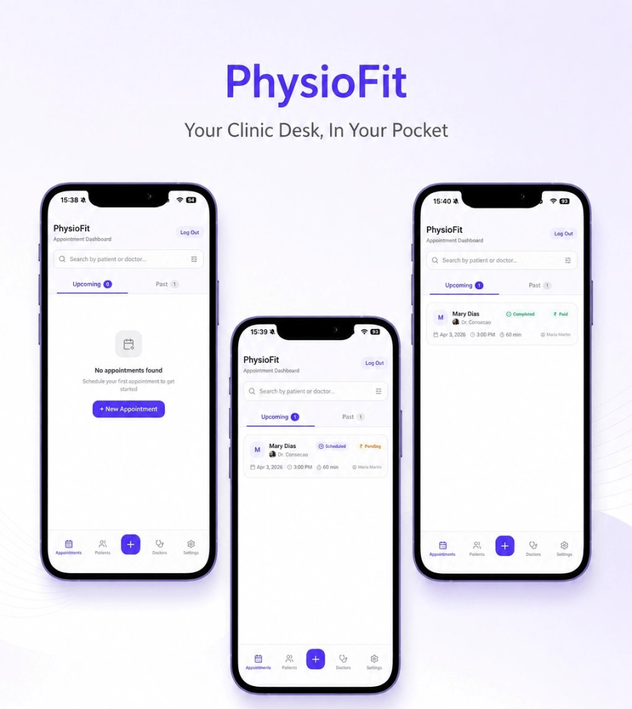
    User access control

    Only approved users should be able to access the app. The app is built in such a way that you can login with Gmail account but you have to be approved before you can enter the dashboard. This was very easy to build in Biscuit.

    Minimum features

    During my initial conversations, I realised that they are extremely busy people. They have no time for figuring out a cluttered app with tons of unnecessary features. Every input field and every navigation item is carefully added serving its purpose. I even removed extra features which were not necessary for the first phase.
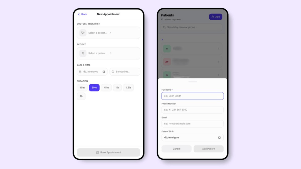
    Contextualising the app

    I was building the app from Amsterdam and it was going to be used in India. The currency symbols, the appointment timings etc were all supposed to be in Indian context. This took some time and testing.

    Launching the app

    I published the app and it is hosted on Biscuit’s own domain. I have not bought the custom website domain yet. While I have the choice of doing it in Biscuit, I wanted to ensure there is enough adoption. I wanted them to create at least few appointments, experience the user flows and give me feedback.

    How I operationalised the app

    This step was not as easy as “here is the link, use it.” I made sure my friend and her team understood how to use this app. I recorded a detailed video by sharing screen on my phone. I gave instructions in Marathi, my native language.

    Here is what the video included:

    1. How to add the app to home screen (since this is a web-app, there were couple of extra steps)
    2. How to login for the first time
    3. How to create first client data
    4. How to create first appointment
    5. How to edit client and appointments

    These things seem trivial at first but they were absolutely crucial for someone to get started.

    How I monitor the app

    Analytics

    Custom Events: The Product Manager in me went straight to the Custom Events in the Analytics page. I setup some custom events for the core actions in the app. While Biscuit gives me basic analytics for my app, custom events were more important to me.
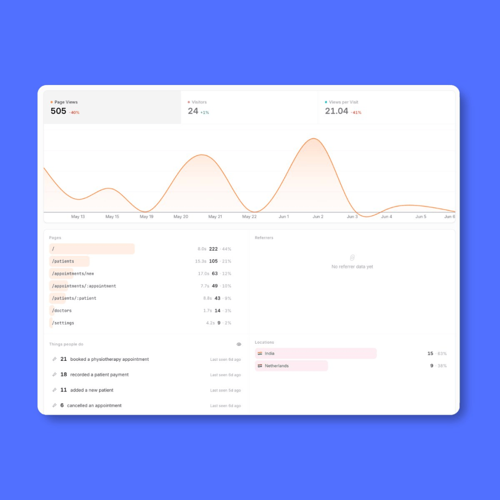
    Checking App in the preview

    I make sure that the app is always functional and I do this in Preview mode in Biscuit. I just come and click around to make sure everything is working fine.

    Regular check-in

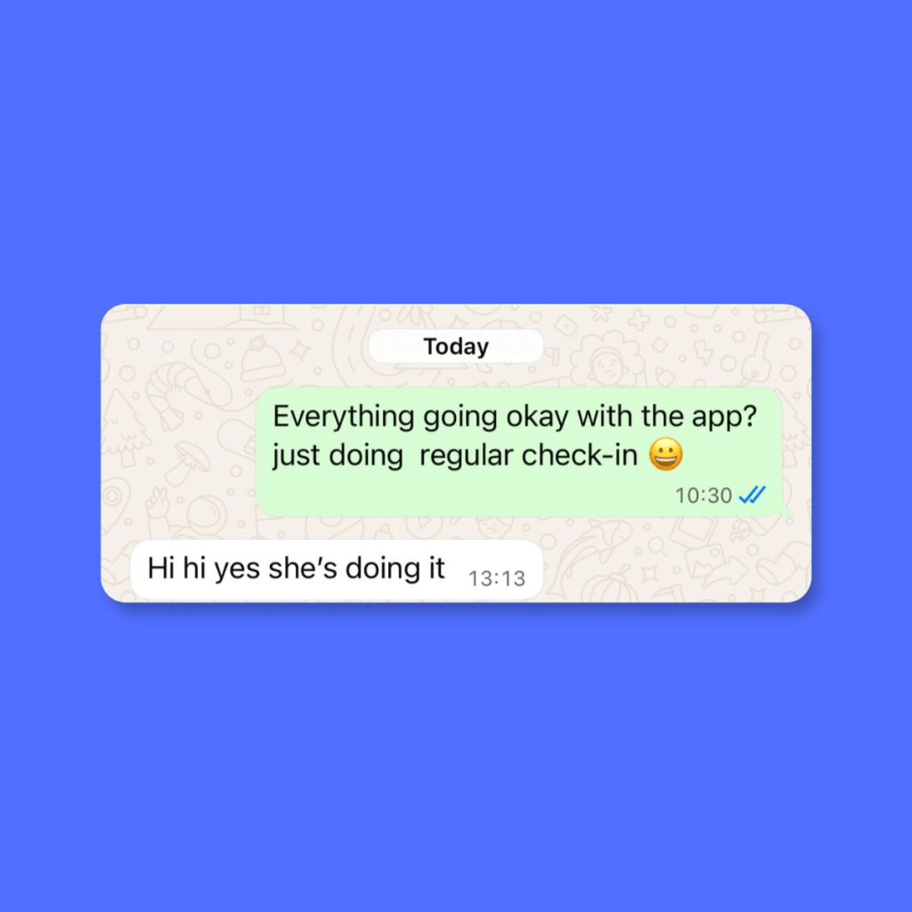
    I also do a regular check-in with my friend on Whatsapp from time to time. I also call it regular check-in. 😀
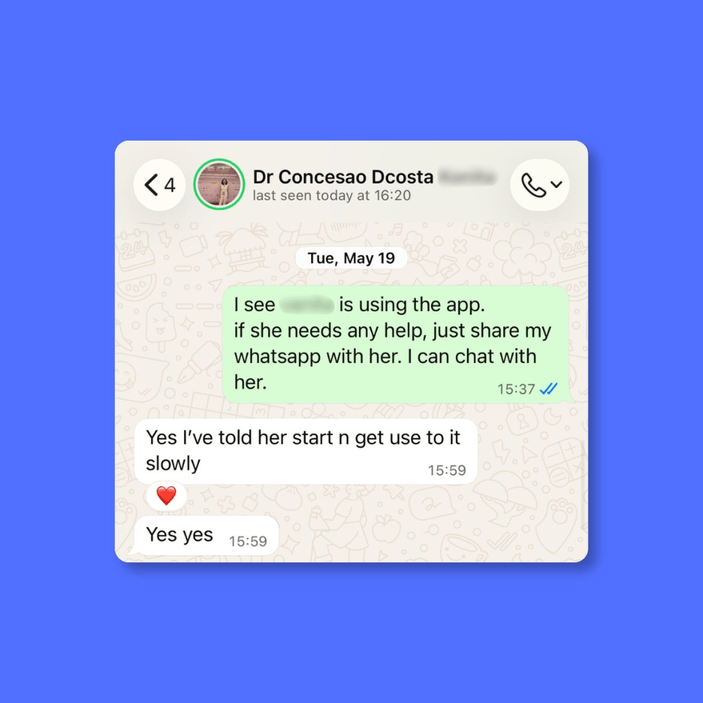
    Here is how the growth looks like

    They have been actively using the app for 4 weeks now.

    Week 1 → They added 2 clients and 2 appointments.

    Week 2 → They added 20 clients and 4 appointments.

    Week 3 → They added 8 new clients and 13 appointments

    Week 4 → They added 11 new clients and 21 appointments.

    Last week, they started adding client intake forms via document upload feature. 🎉
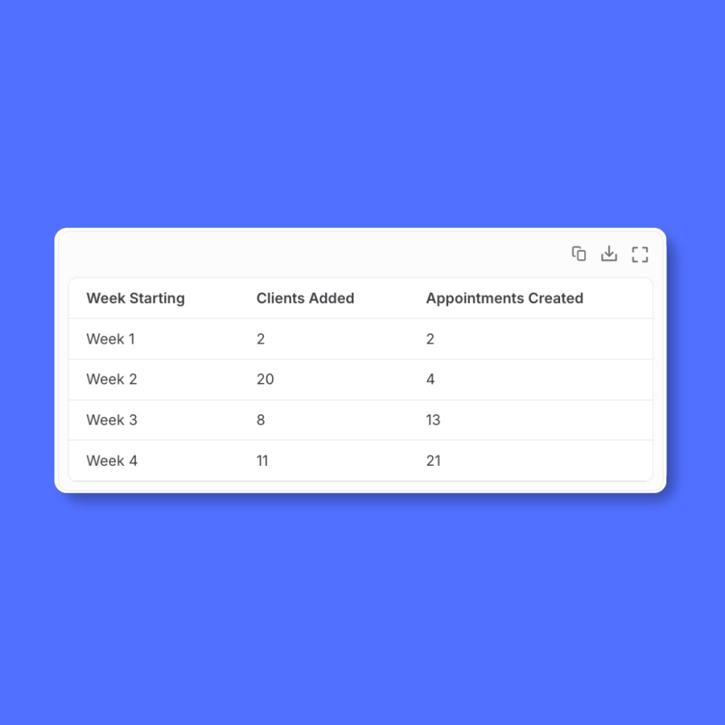
    I got the above analysis by simply chatting with Biscuit.

    So far they have not reported any issue or bug in the app. ♥️

    Challenges

    • One week after delivering the app and sending the onboarding guide, there was no activity. No one signed up. I wondered if I wasted my time. I asked them and found out that my friend’s business phone was damaged and she was getting it fixed. This was totally unexpected challenge but a real blocker.
    • In the second week, there was still no activity. I asked again and found that they had started watching the onboarding guide, went till login flow and something else came up. They abandoned.

    It takes time to operationalise your app. Regular follow-up and timely support always helped.

    App safety and security

    I have never built and launched apps all by myself. While I worked as a Product Manager, I always had a team of Software Engineers. While I could build with Claude Code, I was not confident enough to handle the scale and the security. In simple terms, I would not know how to fix things if something went wrong.

    This is where, I think, platforms like Biscuit win. They have to ensure reliable infrastructure not just for my app but for all the apps on the platform. They take care of:

    1. App security and safety
    2. User authentication
    3. Database that scales well

    It is fully hosted solution which means I cannot take the code out of there and add to my Github. You could argue that this is a downside. However, that’s not the case for me because I love the fact that they take care of everything and I don’t have to worry about those things.

    How much does it cost and do I make money?

    Right now, I have invested my own money, which is not a lot. I only have to pay Biscuit subscription. While I do work here, I separate my personal ventures from my official work.

    I can track my usage in the Biscuit project. I am still figuring out the pricing plan for the app. Although, I am thinking of another plan to create something bigger and Physiofit is my first step in that direction.

    What’s next for Physiofit app?

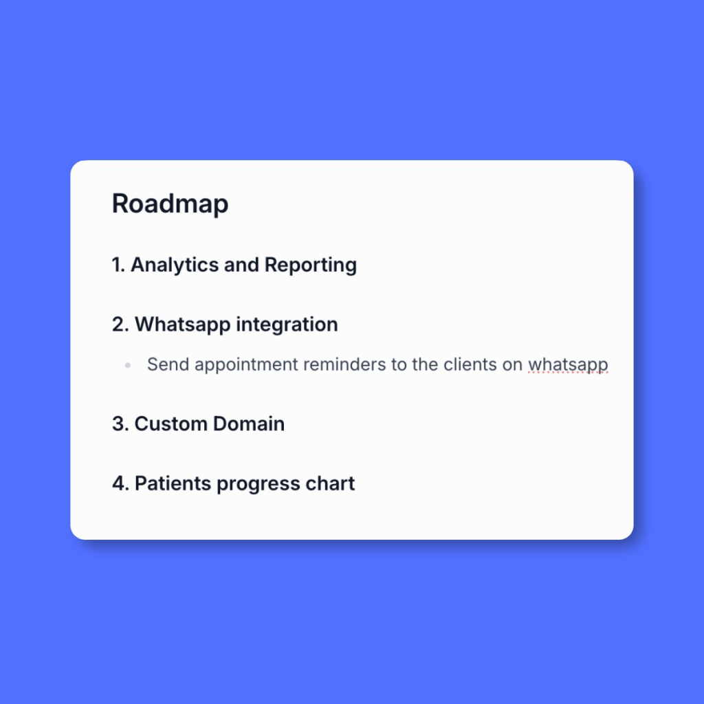
    Well, my roadmap is already developing. 😍
    A huge thanks to Dr. Consecao Dcosta-Colaco. Check her work on

    Instagram.


    If you are inspired to build something of your own, try in Biscuit →
    https://biscuit.so/?invite=74PJW5

  • Working with Compliance as a Product Manager: A Practical Guide

    Working with Compliance as a Product Manager: A Practical Guide

    Let’s talk about working with compliance as a Product Manager. Whether you are a Product Manager or you aspire to be one, you will come across the world of compliance and risk management. This is especially important in industries or domains that require heavy regulation.

    For example, financial services, healthcare, medicine, food etc. are all heavily regulated.

    While you are not expected to be an expert in compliance and risk management, you are expected to understand what this means for the product and for the business.

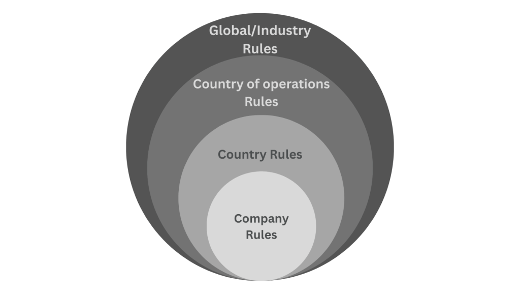
    How does this really work? Let’s begin by first understanding the levels of compliance.

    Number 1: Company-level compliance

    At the very center, you will have compliance rules at the company level. There are certain guidelines that the company abides by and defines as standards to adhere to. These become your compliance rules.

    For example, “We do not want to sell our products to people under 18 years of age.” That’s a compliance guideline set by the company.

    Another example might be: “We do not wish to sell in a certain country or continent.” This means when your user tries to access your product from that country, they need to be blocked or restricted.

    Number 2: Country-level compliance

    The next level is compliance guidelines applicable in the country you are based in. For certain industries, each country sets up a bunch of rules and regulations for the safety and benefit of their citizens.

    Let’s say you are headquartered in USA and you wish to sell medicines online. USA might have a regulation that requires certain medicines to be FDA-approved before selling online. It is your responsibility to ensure that your online store cannot sell those specific medicines unless they’re FDA-approved.

    Let’s take another example. Imagine you’re in financial services or fintech sector in India. One of the rules for international transfers might be: “You cannot transfer more than $10,000 in a single payment.” If your product offers international payment transfers feature then you have to ensure that people don’t transfer more than $10,000 in a single payment.

    Number 3: Compliance in country of operations

    Suppose you are based in Singapore and headquartered there, but your products are being sold in the USA then you must also comply with USA regulations.

    Being compliant in Singapore alone is not sufficient anymore. You must be compliant in your home/base country and in every country you sell your product in.

    This is where many junior PMs make a mistake. I made a mistake too. I assumed that our product was ready for the global expansion only to realise later that I needed to be compliant in each new country that we expand to.

    Number 4: Global or Domain-specific compliance

    Finally, there may be compliance rules specific to your product’s domain or applicable globally. For example, The OFAC (Office of Foreign Assets Control) in the U.S. may blacklist certain countries or individuals. The OFAC is a financial intelligence and enforcement agency of the United States Treasury Department. While it is meant for the USA, their list of sanctioned people and countries is widely used by the Fintech companies.

    Why is this important? International payment transfers are very risky. People send money for all sorts of wrong reasons. While there are multiple ways to prevent fraud, one of the ways to detect is to validate sender and receiver details. Suppose the receiver is a criminal organisation and it is part of the OFAC sanctioned list then payment apps block such payments.

    Similar to OFAC, there will be other global bodies that may be relevant for your product’s sector; and you need to be aware of those.

    Why do we need Compliance team?

    Most companies will have Compliance team. They have titles like “Compliance Officer”, “Risk Analyst”, “Compliance Manager”, “Fraud & Risk Analyst” etc. People with these titles come with vast experience of the domain knowledge. If you are part of a company that does not have a dedicated Compliance Team then you should talk to your managers or core team and establish the key decision-maker.

    Here are 3 reasons for having a dedicated team:

    1. Awareness of implications for non-compliance: This is by far the most important reason. A company should be aware of all possible implications for not complying with rules and regulations. The implication can be as small as minor fee or as big as a multi-million dollar court case. It is the team’s responsibility to understand and break down these implications and ensure that the product is compliant. They work with the Legal team to ensure that the company’s interests are protected at all times.
    2. Keeping up with the authorities: Regulatory authorities continuously make changes to the policies and issue new guidelines. This team knows the right place to get the latest updates and make sure they don’t miss out on critical updates.
    3. Understanding the legalese: If you have ever seen a guideline or a document issued by any regulatory body, you know how incomprehensible it can get. With their experience in reading these complex documents, they are able to decode it much faster.

    You might think this all sounds very trivial. But in reality, it is not nice to get police complaints and legal notices.

    What is Product Manager’s role if Compliance Team exists?

    Compliance team’s focus is to protect company’s interests at all costs. This means at times, Compliance team will seem like a blocker. They would want to impose all types of restrictions. While some requirements are non-negotiable deliverables, some other requirements might be negotiable. Let me explain what I mean by negotiable with an example.

    Suppose you are in Fintech and your app allows people to send money from their account to any person anywhere in the world. Now, imagine a regulation that says, one person in Country A cannot send more than $10,000 to another person in Country B in a month.

    Your compliance team could say, “let’s block all transactions between Country A and Country B on our app.” This is the most restrictive interpretation of the rule. If you read the rule again, you will understand that the limitation is on the total amount a person can send in a month. This type of requirement is negotiable and open to discussion.

    An example of non-negotiable requirement would be “government has ordered all companies to stop the transactions between Country A and Country B”. You have to simply deliver on this.

    Since a Product Manager is responsible for the success of their product, you often have to find the right balance between being compliant and harming the user experience.

    Therefore, a Product Manager is required to advocate for the users while the Compliance team advocates for the company.

    Framework to approach compliance requirements

    Let’s do a thought experiment. Imagine you’re now part of a product that has to be compliant whenever you make a new feature release. How do you proceed?

    If you are absolutely new to the product you might have to do some prep work.

    • Identify the Compliance team or member responsible for final decision-making.
    • Identify the relevant regulatory bodies for your product. Read more about them and their frequency of issuing new policies.
    • Understand the existing rules and why they exist.
    • Go through the current user’s journey and make a map of it. Try to break down the journey in smaller chunks and then create detailed map of that user’s journey.
    • Ensure there is proper documentation of all the existing rules and validations that make your product compliant.

    By doing the above steps, you become more knowledgeable and your opinions will have depth during the meetings. If you skip these steps you are more likely to play catch-up game during important discussions.

    When dealing with new feature request from Compliance team

    You begin the Product Discovery phase and document everything:

    • What are the exact rules issued by the regulatory body?
    • What changes are expected in the product?
    • How does the current user experience look like?
    • What will change in terms of UI?
    • How should we communicate with the users and other teams?

    Tip: The key here is to be concise and precise when documenting the first draft.

    By the end of your short discovery, you will have clear idea of what changes are expected.

    Next is, Prioritization. It is very likely that you are swamped with work because you might have committed to a roadmap already. Before you open discussions with other stakeholders you need to know following things:

    • Is there any deadline set by the regulatory bodies? Is that deadline negotiable?
    • Do we have any legal implications for not delivering on this requirement?
    • Does it line up with our current company strategy? Or are we doing this for the sake of doing it?
    • Other than being compliant, are there other potential benefits to be unlocked, e.g. can we expand to another market easily if we do this now?

    Tip: It is very tempting to neglect requests from Compliance team but ignoring them can have dire consequences for your product. As a PM you should be aware of all risks.

    Assume you have the highest priority for this feature request, you then begin Design and Development phase. You can follow whatever process you have when it comes to design and development but ensure the following:

    • Share the first drafts of your design for early feedback.
    • Once you have final designs, share them with other stakeholders that might get impacted by the upcoming changes. For example, if you are making a change that has positive impact on business strategy then inform Business team so that they can prepare their pitches accordingly. If the change adds more work to Operations team, then show them the designs and help them prepare ahead of the release.
    • During this phase, keep an active line of communication with the Compliance team. They have to be aware of delays.
    • Give clarity on deadlines and expected end result to your Development team. Inform them about the implications of non-compliance.

    Tip: Design and Development is highly collaborative phase because during development you will encounter new blockers. As a PM, you should facilitate elimination of these blockers.

    Next comes, Testing phase. In my experience, getting your compliance team to test the features before release is very useful. It depends on the criticality of the feature and the availability of the team. Following things are important to do:

    • Prepare a short demo video and share with the team before you release to production.
    • Be flexible for the last minute changes to the feature.
    • You might get a list of improvements soon after the release, these should be documented well.
    • Document the potential impact on other teams and communicate that ahead of time.
    • Keep your legal team updated as well.

    Tip: When releasing critical changes, test the product yourself.

    Don’t skip Post-release monitoring. Most people move on to another feature. Here is what you need to be aware of:

    • Add event tracking wherever possible. This will help you create dashboard in analytics tool later.
    • Create reports and add them to your regular review meetings. This way, you can keep track of the feature performance.

    Final words

    Working with Compliance team might make you feel less autonomous but that is the reality of working in regulated industries. Don’t seek full autonomy and don’t work in silo.

    Compliance team will continue to advocate for the company and Product Manager should continue to advocate for the users. This is the balance you strike as a Product Manager.

  • Digital Payment Methods in India: UPI, Credit Cards and more

    Digital Payment Methods in India: UPI, Credit Cards and more

    We have come a long way from getting INR 10 cash from our mothers for Parle-G biscuit to making payment with single clicks on our phone.

    note: this image is generated with AI

    Cash was the only mode of payment in India — until we saw mass adoption of new technology and mobile phones.

    In India, we see new payment app released almost every month. While UPI payments had accelerated the digital payments space, there are several other modes of digital payments.

    Since 2016, I have worked in 5 Fintech companies across payment gateways, global money transfers and prepaid cards. In this blog, we’ll explore various payment modes available in India.

    • Bank account to Bank Account Transfer (e.g. NEFT)
    • Cards (Debit, Credit and Prepaid)
    • UPI
    • Digital Wallets
    • Pay Later

    Bank Account to Bank Account Transfer

    This mode of payment lets you send the money directly from your bank account to another bank account. NEFT, RTGS, IMPS fall under this category.

    In order to transfer money, you will need the full Bank Account details of the receiver like Account Number, Account Name, Bank Name, IFSC code and Branch Name.

    They work well when you have to transfer large amounts. This method is very popular when businesses have to pay for big invoices.

    However, it is highly inconvenient on online shopping sites or anything that demands instant payment confirmation to both sellers and buyers.

    Another drawback is that receiver may not always get the sender’s details. While some banks have tried to improve this, a lot of banks have not.

    Through IMPS you can send the money instantly, while NEFT and RTGS could take longer.

    NetBanking

    Netbanking emerged as an intermediate choice to make a payment. I’d like to think of it as a choice in between NEFT and Card. 

    This is how it works, if you are on a shopping site and you chose Netbanking, you are redirected to an authentication page. This is where you will either enter your password or OTP and then the payment is successful. You need not know seller’s bank account details. It is a step up from Bank to Bank transfer. It works only if you have a bank account and sufficient money in it.

    One of the limitations is that not all banks support this payment method.

    Cards

    There are 3 types of cards:

    • Debit
    • Credit
    • Prepaid — Debit cum Credit

    They come in a plastic or metal form. You can get a card either from your bank or any financial institute like American Express. Cards add a lot more convenience when compared to above 2 choices for payments.

    They come with controls like payment limits, blocking a card and changing PINs when required. While cards are issued by the banks, a card network provider like Rupay, Mastercard, Visa, Maestro is required. These Card Networks act as intermediate layer between Merchant’s bank, your bank and you. 

    Card Networks and banks work together towards fraud prevention and consumer protection. Because they offer these services, Card networks charge a certain fee on each transaction to the merchant. Depending on the fees sellers can choose which card to allow and which to avoid. You will notice American Express is not widely accepted at retail stores.

    All cards issued in India will work in India but for international payments, you might have to contact your bank. While many banks have made it easy in their apps, other banks still operate in traditional way.

    Debit Card

    Debit card is connected to your bank account. It works only if you have sufficient money in your bank account. And this is the key difference between your debit card and credit card. I will explain Credit Cards next.

    Many banks issue Debit cards free of cost when you open a bank account. It lets you pay at stores, online sites with ease. You can also control spends by setting up payment limits.

    Credit Card

    It’s in the name, it is a credit. Imagine getting a loan for 45 days without any interest. You get a certain limit, say INR 1,00,000. You can spend upto 1 Lac and pay the bill later. Of course, if you cannot pay that bill, you will be charged fees for the late payment. This is usually considered risky payment method because you may be tempted to pay more than you can afford.

    People are attracted to Credit cards because they offer some rewards. The more you spend, the more rewards you get. Rewards are usually in the form of points which can then be redeemed.

    Banks are quick to give out Credit cards with lower limits like INR 10,000 to INR 25,000 to masses. However, to get higher limits like INR 1,00,000+ requires certain income. Some banks also assess your spending capacity and your payment history. If you had missed credit card bill payments in the past, you are less likely to get higher limits.

    Paying credit card bills is also easy. You can directly pay from your bank application or use apps like Cred.

    Prepaid Cards — Debit cum Credit

    You will have to know some technicality to understand this payment method and why it is used. This type of card behaves like a Credit Card but does not have credit limit.

    A card has 16 digits card number. They are either printed on the card or shown in the mobile app. The first 6 digits of the card number is called BIN (Bank Identification Number). It helps identify the type of card. Numerous websites accept only Credit cards but not Debit cards. Debit cum Credit card solves this problem. They offer you a Card that acts as Credit Card but you will have to load money onto it. You can only spend what you have loaded. It is the BIN that identifies this card as Credit card.

    Niyo, Happay are couple of examples in India. Banks also directly offer Prepaid cards. Globally, apps like Wise, Revolut and Monzo are very popular. 

    I did a case study on Wise where I go in-depth about their UX 
    (Check it out here).

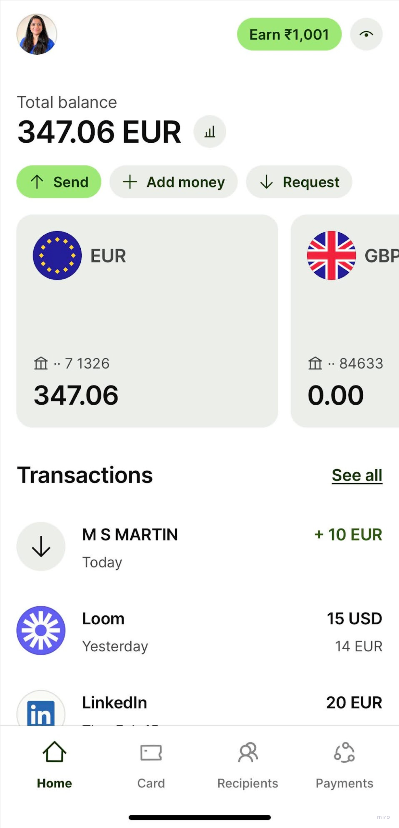
    In the screenshot, EUR 347.06 is the amount I can spend using my Wise prepaid card.

    This is a screenshot of Wise mobile app. It shows the account balance of 347 euros.

    Since they offer less risk to both banks and customers, while also solving a core need, prepaid cards became extremely popular in many countries.

    UPI

    Unified Payment Interface, or UPI has become a household name. Your grandparents might be already using it. It is used for peer to peer and peer to merchant payments.

    When it was first launched, you needed a UPI virtual address to send or receive payment. Nowadays, you only need phone number of the person. In the background, every user gets a virtual private address something like 99XXXXXXX@kotakbank to identify the unique user. UPI is always linked to your bank account which is also linked to the phone number.

    You do need a bank account to use UPI. Each bank might have different limits to send and receive money.

    As soon as banks adopted it, companies like Paytm, Phonepe, Bharatpe, Google Pay capitalised on the opportunity to make it easy for the merchants to receive payments via QR code.

    While UPI works beautifully for small payment amounts, NEFT and Cards are still the go-to choice for large sum of money.

    A simple google search should help you understand the scale of this technology and how it became a huge success. It’s an incredible story from digital India.

    There is another category of payments that you might have come across. These payment methods still use your bank account but they have different flavours.

    Digital Wallets

    Products like Paytm and Phonepe have popularised this type of payment method already. Almost every B2C product seems to offer “Wallet.”

    I will skip the technicality on how these Wallets are actually created and how they work in background.

    In order to use the Wallets, you first have to load the amount from your bank account. Usually, there is a limit between INR 10,000 to INR 20,000. Every month, you can load that amount and use it to make payment. To avail higher limits, you have to complete KYC within these apps.

    Products use Wallet as a hook to retain customers. For example, when you order food on Swiggy, they can give you some discount if you use their wallet. You will be tempted to load money in order to avail this discount.

    Wallets were very popular before UPI. You could transfer money from your wallet in Paytm to someone else’s Paytm wallet. It facilitated peer to peer transactions easily.

    Pay Later

    This is similar to how your shopkeeper in the neighbourhood used to give you “udhaar” or credit. When you shop online, you can choose to pay the amount later within X number of days. The number of days depend on multiple factors. Typically, you will see 30, 45 or 60 days. Lazypay is an example for Pay Later option. In Europe, Klarna Pay Later is quite popular. You will also be charged some interest amount.

    The biggest risk is the non-payment. Many people can buy once and never pay back. When companies offer this choice, they usually allocate a budget for such risky transactions.

    Another factor is, collection. Your neighbourhood shopkeeper can show up at your house but these companies cannot trace you easily. You will receive many calls but it’s easy to buy a sim card and discard it.


    If you found this interesting, you might be interested in a case study on UX of Indian & Dutch bank mobile app, check here.

    Also, don’t miss Swiggy (Indian) vs JustEatTakeaway(Dutch) case study. See here.

  • Why Amazon’s Kindle is More Than a Device: It’s part of ecosystem

    Why Amazon’s Kindle is More Than a Device: It’s part of ecosystem

    In 2007, Amazon’s Kindle device sold out within few hours of its launch. Since then they have sold millions of devices. But why did Amazon start selling an e-reading device? Especially, they sold those devices at no profit. In 2012, Forbes reported that Jeff Bezos confirmed “we sell the hardware at our cost, so it is break-even on the hardware” in an interview with BBC.

    If it is not about the hardware then what is it about? You guessed it right, it is not just about the hardware, it is the ecosystem at play.

    Few years ago, I bought a basic Kindle. I am not an avid reader but I do like to carry books on vacation. With Kindle, I could carry more than one book everywhere I go. Ultimately, it became a habit to read on Kindle than to buy physical copies. Next thing I know I am buying e-books off of Amazon, loading on my Kindle and reading them there. They even have free books for Amazon Prime subscribers, discounts for Kindle editions. I am locked in fully!

    This is an incredible way of achieving retention of the customer through multiple products. We will come to that, but let’s go back a little.

    Kindle’s history: technology and design

    It was first released in Nov, 19 2007. By this time Amazon was already 12 years into the business. There is a very detailed article on its history and how it came to life on Amazon’s site. I recommend you check it out. Amazon’s own research lab, Lab126, developed the Kindle. The device was the result of four years of intensive research and testing.

    The technology

    Kindle uses the E-Ink technology for their devices. One of the crucial features of this technology is its paper-like display. There was nothing revolutionary about the E-ink technology itself. It existed since 1997, though it was popularised by Amazon Kindle. The E-ink technology has manifold applications but the biggest by far was the e-reader.

    Additionally, technology for storing large amounts of data in smaller memory spaces was rapidly advancing. This meant, storing text in computer is very cheap in terms of memory usage. You can see how .doc file takes 5KB but an image file .png can be much larger often 5MB or more. It was only matter of time, when kids would start doing their assignments on laptop, college students researching on internet instead of libraries and working people reading online more than hardcopies.

    For Kindle, it meant you can carry hundreds of digital books with you in a 174g device.

    Now, as a Product Manager, I take away couple of things from this:

    Instead of looking for new solutions and waiting for new technologies to arrive, find ways to solve customer’s problems with existing solutions. It makes you focus more on the problem and solve the right ones. Hard to do but worth doing.

    You could not come up with such a product in 1980s because we did not have that technology at all. You can only continuously research and iterate on products but understand that you may have constraints on the existing solutions available at that time.

    The Design

    A very important aspect for such devices should be the comfort of reading. If you are going to spend 2 hours reading, you cannot afford to strain your eyes. While E-ink technology provided paper-like display, there were other design considerations as well.

    One such feature is changing fonts and size of the text! They even got their own font called, Bookerly. You cannot do that with physical books. Your reading experience is determined by the Publisher who chose the fonts and size for you.

    For the visually impaired, there is an option to read out the text. Their blog covers more on this topic of Accessibility and Inclusion.

    Kindle Basic device’s design is very intuitive and minimal. Their recent versions, however, are loaded with features.

    Kindle does claim to have good design for form factor but based on my personal experience, I think it can be better. I cannot hold kindle for long periods of time. By the way, I experience same problem with books. Ergonomics should get better for such devices.

    However, the first version of Kindle device was nothing like its current version, they had to completely change their design. You can read this post by Josh Hrala on how Kindle has evolved over time in design.

    You have to get the basic requirements right when designing new products. While you can quickly iterate and ship refined versions, it cannot fail on the core value proposition. In case of Kindle, the value proposition was to read a physical book on a digital device in the most accessible way.

    Scope the minimum deliverable but consider usability and accessibility for the bare minimum features in your product.

    Having the right technology and the right design does not always guarantee success. You need distribution. For Amazon, it was not a challenge. Amazon had books and users. They needed to build the connector; a platform for digital reading era.

    Platform for Readers, Writers and Publishers

    Until Kindle’s launch, Amazon had physical book sellers on their marketplace. They needed to create supply for the digital books.

    The platform

    Amazon allowed authors to directly publish their e-books. This created a marketplace for authors and readers and saw some pretty nice growth too. TechCrunch article states, “Between 2010 and 2015 alone, the number of ISBN registered titles jumped 375 percent, from 152,978 to 727,125. Amazon’s CreateSpace accounts for the largest share of that growth.”

    In a traditional setup, small-time authors would have to wait for their publishers to approve and agree to print. Publisher’s credibility and distribution could make or break the success of the book. By directly selling to consumers, less renowned authors could publish directly. This unlocked an incredible opportunity.

    On the consumer side, they were locked in by the Kindle device purchase already. Amazon can now offer free books for Prime subscribers, or discounts on Kindle edition.

    Although Amazon offers enormous platform to the authors, it did not really eliminate all the challenges of traditional model.

    Challenges of the platform

    Amazon requires exclusivity from its Kindle Direct Publishing (KDP) Select authors, meaning they can only sell their books on the Kindle Store, and not on any other digital bookstores, or even on their own websites.

    As per their article Amazon charges royalty of 35% or 70% depending on territories the books are sold in. This is not very different from what traditional publishers would do.

    Authors have to work hard to promote themselves and attract new readers in a crowded marketplace because suddenly, everyone has option to publish.

    It is hard to know how Amazon team plans to handle such challenges but it certainly makes me think more. In a marketplace product, the balance between supply and demand has to be healthy enough for it to sustain. What happens if authors are unhappy? What happens when a lot of authors publish directly but there are no e-book sales? These are not easy problems, companies spend millions on research to handle such challenges.

    Short term success is good but it is good to have an idea about the potential challenges that could arises in the future.

    The ecosystem

    I mentioned in the beginning that I was locked in the Amazon’s ecosystem.

    The ecosystem is basically this, for every purchase of a product there is an auxiliary product or a service from the same company.

    No matter which product you buy first, you can buy related product from the same company. If you buy Kindle device first, then you can buy e-books from Amazon. If you buy e-books, you might be tempted to buy Kindle and so on.

    E-reading device sellers like Rakuten and Kobo are attempting build an ecosystem too.

    When I first saw Amazon selling Kindle device, I thought “Why is Amazon getting into this hardware business?” This is a Product Strategy question asked in many interviews for Product Manager role. “Should Company A expand into category X?” or “Should company B launch this new product?” However, after seeing the way they grew the product, selling hardware was not the main goal, it was to create an ecosystem for the user.

    I have observed this in Fintech companies that often build a baseline infrastructure first, get the customer locked in on the core product and then use this customer base to distribute new products. In India, Cred started as an app to remind you to pay credit card bills. Stripe in USA and Razorpay in India started as payment gateways. If you go to their websites now, you will see lot of other products unrelated to their core product.

    Ecosystem in your context may not mean launching new products all the time. Think of micro-ecosystems of intertwined usecases that your users may not have explored yet. If you notice that a certain feature is not adopted organically, think of new usecases and how it can solve other problems that user may not be aware of. Think of ecosystem and keeping the user in that ecosystem.

    As a Product Manager, you often have to step outside of the Jira board 😉 to think of ecosystem at play.

    Final words

    If you made it this far here is a fun fact about Amazon Lab126, they named it after their logo, 1 for A and 26 for Z.

    Let me leave you with some takeaways:

    • Think of your product features as tiny ecosystem of its own.
    • Keep your user in the ecosystem of your product.
    • Leverage existing solutions and technologies before jumping to creating new ones.
    • You cannot hack product’s quality. Decide on minimal scope but deliver the best you can.
    • Always evolve, don’t let the product go stale.
    • Think about the product’s distribution and marketing strategies while you execute.
    • Acknowledge the fact that a product’s success is a combination of its quality + market forces + timing.

  • Micro-interactions in UX and why they exist

    Micro-interactions in UX and why they exist

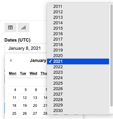
    Have you ever scrolled through an endless list of years just to find your birth year?

    Date picker. Image source: link

    It is a minor annoyance but annoyance, nonetheless. We encounter these micro-interactions in digital products every day.

    On a paper form, you simply write down your date of birth. Why can’t we do the same online?

    In the real world, “01st Dec, 1980,” “01/12/1980,” and “December 01, 1980” are all acceptable ways to write a date of birth. However, analyzing non-uniform data is challenging. Analysis becomes much simpler when dates follow a consistent format.

    This is why user input needs to be collected in specific formats — to maintain data consistency and uniformity. However, for the sake of solving this consistency problem, we cannot sacrifice user experience.

    In the above example, users should be able to both select and type the year. We can validate the entry immediately and prompt for corrections if needed. Put simply, there are always ways to enhance the experience.

    These seemingly tiny details are important in Product Design. This is why, Designers and Product Managers work together to design excellent products by performing research and user tests. Well, at least in theory.

    Let’s take a look at 4 interactions you must have encountered before.

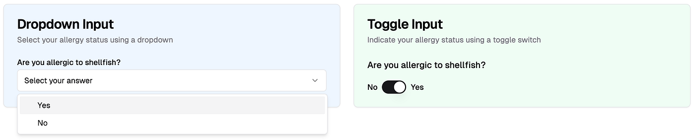
    When you have 2 choices in input → should it be dropdown or toggle?

    Would you have a preference? If it is single question, probably not. But imagine it is a medical form and they need to know all sorts of pre-existing conditions, say 20 questions. Would it be different then?

    Selecting date → what should be the default date on the date picker?

    Should it be blank? Should it default to current date or some arbitrary date? That’s a decision to be made.

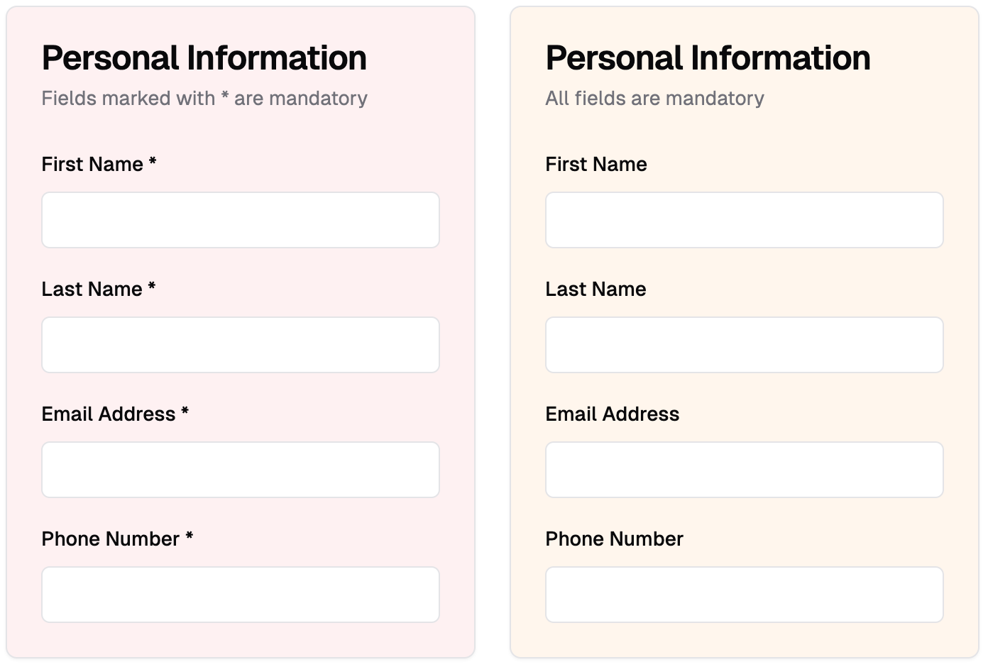
    Indicating mandatory inputs → should we indicate mandatory inputs for all via asterisk?

    Would you have a preference between 1st and 2nd? Imagine slightly longer form where 15 out of 20 questions are mandatory, what will be the design choice then?

    Should the error message be dismissed automatically or by the user?

    It sounds like a no-brainer until you put it in a context and suddenly you don’t want to automatically dismiss the error.

    It is very tempting to choose one over the other. However, without proper product discovery, you might end up choosing the incorrect UI element. It is not the UI element, it is the placement of that element in the context of the product.

    Do this exercise — check a form, preferably a longer one, in your product or any other product. Try filling it without making any errors. Record that experience. Highlight minor annoyances.

    Why do some forms have bad user experience?

    That’s a really good question. The people who build these products often know the answer and it could be one of the following:

    1. Technically challenging: I say challenging not impossible because minor interactions are not impossible to change but they can take time or cause dependencies. You cannot simply change the Date Picker one fine day and not worry about impact on everything else. Think about data storage, analytics, operations work etc.
    2. Design team wants to adhere to some “core principles”: This may happen in certain companies where the design team has strong opinions on the UX. Sometimes, having strong design opinions can work in their favour but other times, it may not. Think of Airbnb; they seem to have strong design opinions but I often think their UX is more complicated than other booking sites.
    3. Time to build and Time to release: If you have ever worked in the Design, Product or Tech team, you will know that every discussion boils down to “We have a tight deadline therefore, only highest priority items can be fixed.” Inevitably, minor interactions are never highest priority. This is why, you will notice some popular products with poor UX.
    4. Design Debt: Just too many optimisations causes inaction. As a designer, if you list all the improvements for your product you are going to have at least 10–15 things on the highest priority. Knowing your team’s bandwidth, you may not even highlight those issues. Therefore, you continue to accrue debt.

    Is there no way out?

    Of course, there is. Every company eventually finds a way out to resolve these issues. However, the reasons to do so will depend on the company’s priorities for that month, quarter, or year.

    Let’s say, too many people drop off before completing a form and that causes users to not subscribe or pay. This is a huge risk. It affects business metrics. You bet, the whole team is going to work for next few weeks fixing tiniest of UX issues.

    Compare that to filling up a feedback form inside the dashboard, it is not perceived to be huge risk.

    It is a delicate dance between company priorities and great user experience.

    From my experience as a Product Manager, the best way to minimize this type of debt is to invest time upfront in discussing and debating on micro interactions, carefully weighing the pros and cons of each UI element before development begins.

    Which micro interactions have annoyed you recently?


    Shout out to my ex-designer colleagues — AnasNikos and Denis. They always challenged me to think differently. And I could nag them with my thought experiments.

    Note: All visuals in the example section have been generated using V0.dev product. I explored V0.dev a while back: check here

  • Writing effective Product Release updates to your team

    Writing effective Product Release updates to your team

    Before transitioning into Product Management, I led a small team of Customer Success Managers. At our company, the Product Manager would send updates when new features and improvements were released. I’d read these emails to identify what was important for my team and our customers. The emails were usually clear.

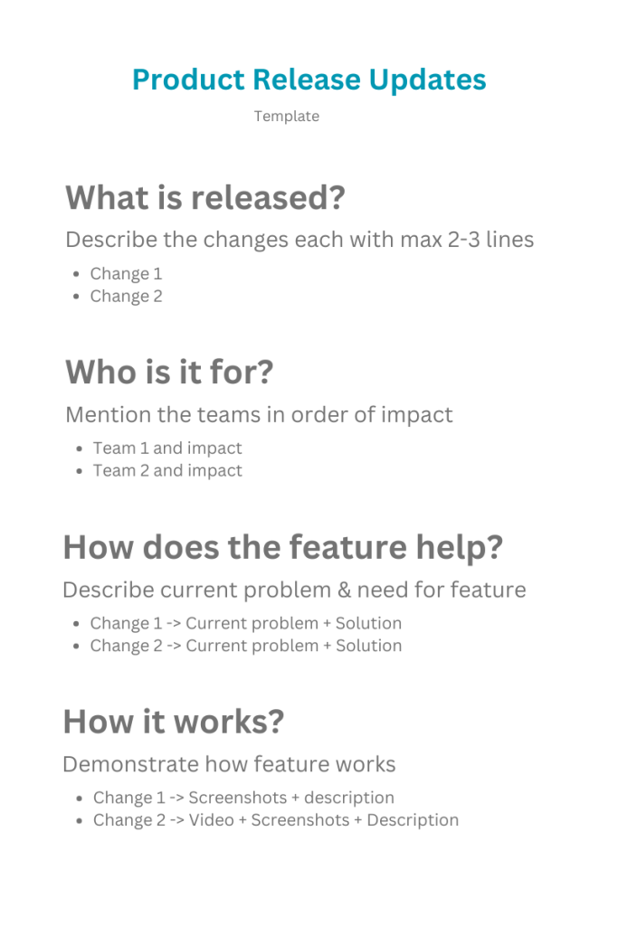
    At that time, I focussed on just three key questions: What was released? Is this relevant for me or my team If relevant, how does it benefit our work? Any information beyond these questions wasn’t particularly useful for my role.

    This context is important because despite knowing the needs of the team, I still struggled to share product update emails that were helpful.

    I got very excited about features and I wanted to share every tiny detail with the team. I used to write lengthy release update emails. My good friend and ex-manager once told me, “Your CEO (or team) doesn’t have time to read novels”(referring to my long emails). In any other setting, this might sound harsh, but coming from a friend, I asked how I could improve. His suggestion was simple: be specific and concise. I tried to do exactly that.

    I adopted different formats for different features. For example, suppose you launched something really big, which is worthy of a blog post or even a PR article, you might want to plan that very differently. By the way, this article won’t cover it. Let’s be real, on a regular basis, you are probably doing bug fixes, product improvements and fixing technical debts. How do you then make it easy for yourself as well as easy for team to understand?

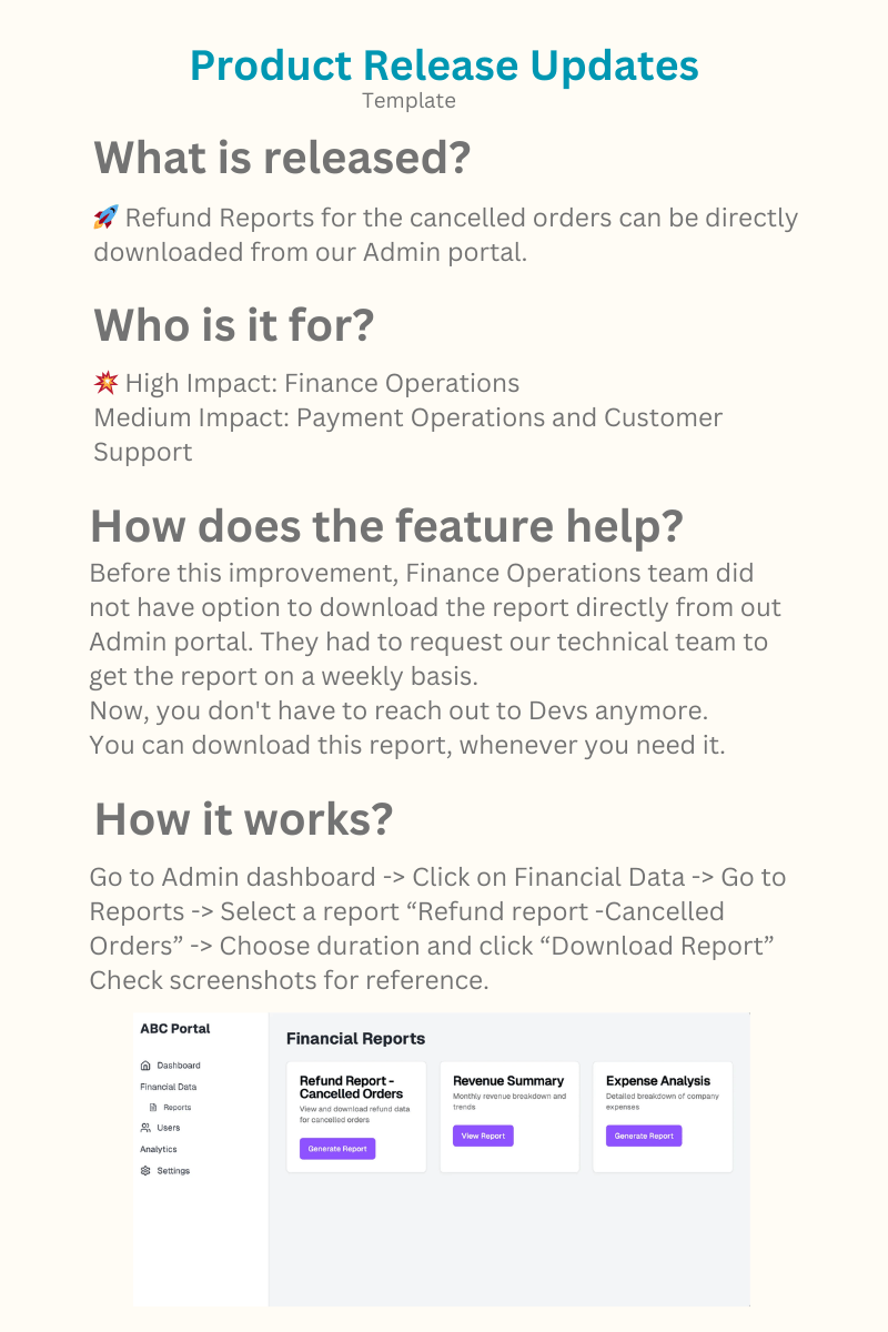
    I am sharing a template that I have used regularly.

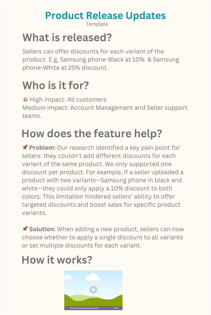
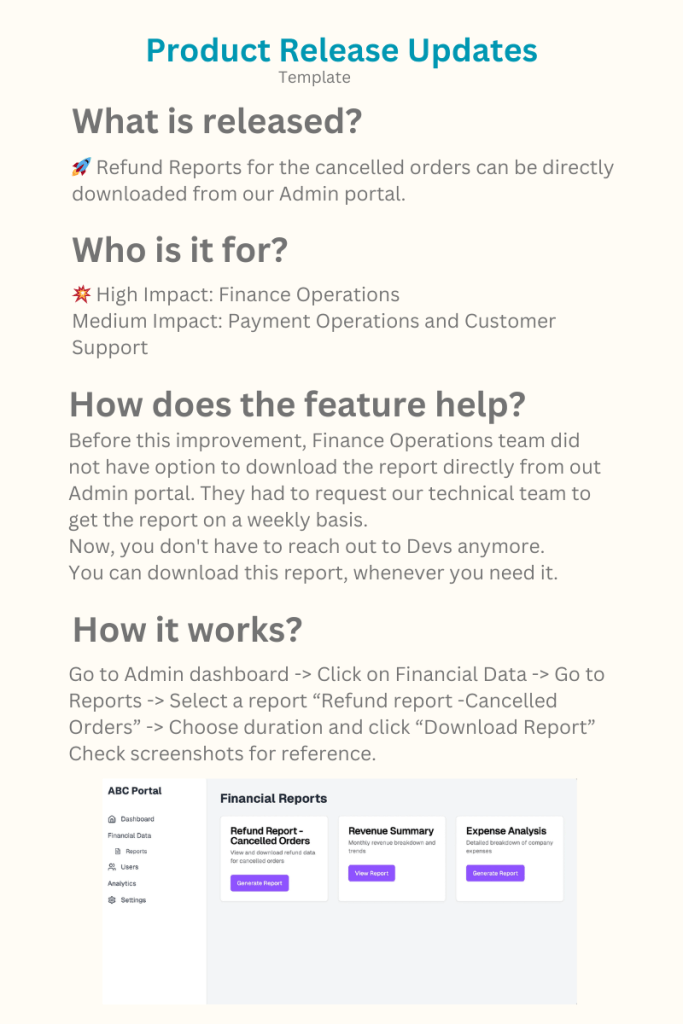
    Now, let’s see how it will work realistically. We will take 2 examples for an imaginary order and catalog management product meant for Sellers of an e-commerce website.

    Example 1: New feature in the product, solves a big pain point for the customers.

    Example 2: Improvement to an existing feature that solves major problem for the internal Finance Operations team.

    Finally, just because I suggested a template does not mean it’s the right way or the only way. Come up with your own template but keep the basics in mind — No one needs to read a novel and yet, everyone needs to know meaningful changes in the product release. Try to make it concise.

  • Detergent bottle cap design made me go “Aha”

    Detergent bottle cap design made me go “Aha”

    Imagine this.

    It’s laundry day.

    Argh. You already hate it.

    You load the machine with clothes.

    You unscrew the cap of the detergent bottle.

    Pour the liquid.

    Put the cap back on and Ahhh! Some detergent leaks out.

    Now, take this Detergent Bottle Cap. Do you notice anything different?

    It’s brilliant design.

    It looks like a no-brainer and yet, you don’t see it everywhere.

    It is not a ground breaking invention. Perhaps, no one even notices it. It makes an impact on your daily routine for just a fraction of second. To me, such designs are very impactful and thoughtful.

    Designing a user-friendly bottle cap doesn’t directly increase revenue. Consumers don’t choose a brand solely for its superior cap design. Yet, companies invest time and effort to enhance these small details, making your life a little easier.

    Until I read the book, “Design of Everyday things” by Don Norman, I never paid attention to the design of physical products. And until I became a product manager, I never really paid attention to the design of digital products either. But now, I think about product’s design all the time.

    You might think, “How hard can this be? It’s just a bottle cap.

    “While that’s mostly true, manufacturing physical goods is quite challenging. It involves long, tedious processes. You can’t simply change the design in your cool software and expect to release it in the next batch. Digital products, on the other hand, have that advantage of “rolling back” a release when it doesn’t meet expectations. With physical goods, you can’t simply roll back—there are dependencies from design to production phase.

    Most manufacturing companies often outsource the production of certain parts. You design a part, create specifications for it, send it to your manufacturing unit. Now, this unit needs to support the design. If the manufacturer does not have the right equipment, they have to procure it. It is not same as spinning up another server with a single line of code or one-click action to scale up your digital product. Of course, I am over simplifying here but you get the idea.

    When you take into account all these factors, you suddenly realize it may not have been an easy task to push such a design into production, especially when most detergent bottles in the market come with a standard cap.

    Of course, once it becomes a standard design, it makes waves, and production becomes much easier.

    So if you cannot change design on the fly, how do you iterate? How does the team validate the design choice?

    Interestingly, digital and physical products share similarities in this aspect. You don’t always need to go straight to production. Instead, you can test your concept by creating a prototype—a working model that illustrates the user’s experience. This prototype serves as a tool to validate both your design and concept.

    There is a cool video on Youtube on how car companies use clay modeling to experiment with design concepts.

    Digital products also have prototypes. Check this prototype from Figma Community member. You can interact with a mobile app design without involving the software developers.

    But, I digress.

    For now, my detergent bottle has impressed me. It solves a tiny problem in my life and I derive immense satisfaction from it. Their core product is already good but design like this makes me go “Aha😊.” That’s the moment you want to have from your customers.